Basically, it's a pared down version of PS, available for free and on the internet. It's got a lot of great pre-set conversions on there to adjust your photos with a simple click of a button, without having to commit money, space on your hard drive, or time.
I highly recommend that you just go over there and play with it some, but because I know there are always links thrown at you on the internet with the persuasions of "Go on, try it, you'll like it!", I have a few sample shots of what this can do for you.
Registration is easy- just some basic information and then you're ready to go. This program seems really user friendly to me- I really like it a lot. Once you've gotten onto the actual editing program, you'll need to upload a photo.
You can upload by either bringing one in directly from your computer, or from flickr, photobucket, picasa, or facebook.
This is the one I am using... straight out of my camera.

My word, she is such a little beauty. I do not want to think of what it's going to be like around here in about 12 years.
I opened it to "edit" and then started messing around.
The first thing I did to play with this picture is to play with the saturation by clicking the "saturation" button on the left tool bar.
The neatest thing (to me) about PS Express is that every time you want to make an edit on a photo, it does this little filmstrip looking thingamajig on the top of the page. It basically is showing you different options and varying degrees of editing within that section.
The top of this one so all the different saturation options, from entirely desaturated to over-saturated. Whenever you mouse over the different mini-photos, it'll show you on the big screen what it looks like. You can always revert back to the original photo by clicking that one.
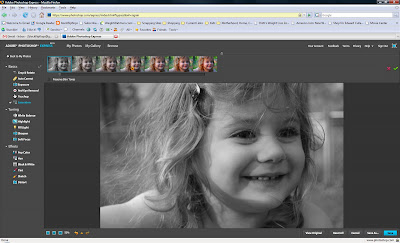
This version of the photo is with having the "Preserve Skin Tones" box checked- it makes the background black & white and the cute little model in color.
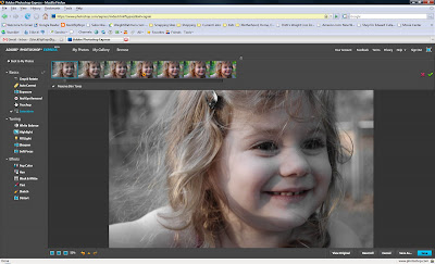
This one is with it unchecked- totally desaturated. You could do this version instead of just the "black & white" button that is further down if you wanted to tweak it more with the other buttons (like highlight, soft focus, etc.).
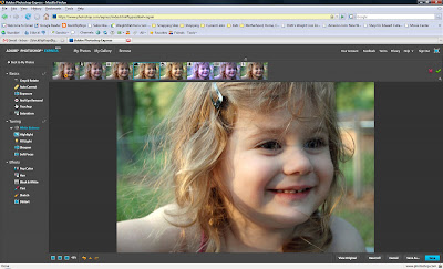
Another nifty little feature is the white balance adjustment... say that you always keep your camera set on the "auto" function... that usually works out best for you. But sometimes- in weird lighting- it gives you a funny tint. Or maybe you are learning the manual settings, but like me, you don't really know what you're doing yet.
This button is for you. ;)
You can select the sort of light it was taken in- or just pick the one you think looks the best from the film strip on top. It will automatically adjust it so that the color white (and all the other colors) are "true".
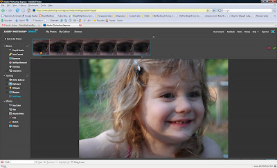
 You've also got a fill light button, which I don't really have a good example for here, but basically it means that you've taken a photo where the subject has a lot of dark shadows on their face (say, your hubby wearing a ball cap)... the fill light button will add light to the face of the person to fill in those shadows.
There's a sharpness button- with varying degress of sharpness.
(Pretty self-explanatory, huh? I told you this was user friendly!)
Some other fun stuff:
Color Pop (aka Blue Meanie Conversion)
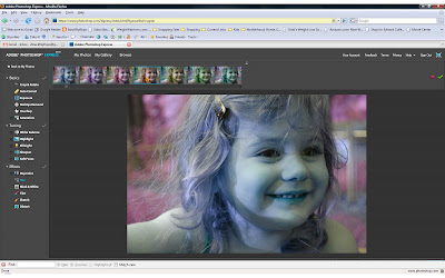 Distort:
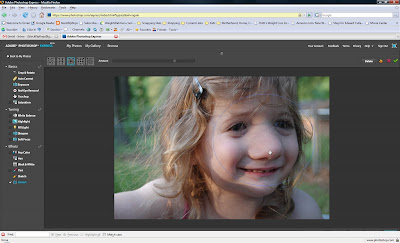
Sketch:
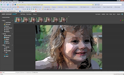
Tint:
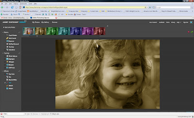
One final note- remember, you can combine several of these different options to have one final product that has a great look....
Photo turned black & white (I picked one of the versions that had more contrast):
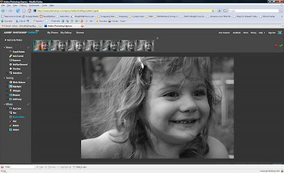
Photo sharpened:
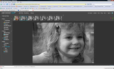 Photo highlighted:
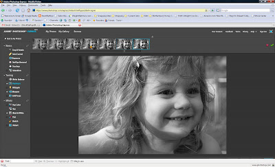 Photo crop & rotated:
 Hmmm... a few little crumbs on that left cheek:
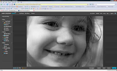
I'll just use the touch-up tool:

Voila!
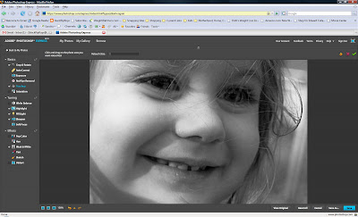
From this:

To this:
(I personally favor the color photo a little more, but this is all just an example to get your mind going!)
Have fun and do a little playing! :) Let me know if you try it out and what you think...
p.s. I get no endorsement from Photoshop for showing this! hehe

I agree about this program. It gives you so many options. Your kiddos are beautiful.
ReplyDeleteGreat tutorial!
ReplyDeleteYou are so AWESOME. I probably won't get my Elsie Challenge done today because now I just want to play with this!! lol :) great tips Mrs. V!!
ReplyDeleteWhat a fun and easy program to work with.
ReplyDeleteWhat a fun and easy program to work with.
ReplyDeleteI didn't know about the express version. Thanks V!
ReplyDeleteThanks for the awesome tips as always! :-)
ReplyDeletei remember noel telling me about this but forgot until this post!
ReplyDeletethanks for the reminder :)
I loved this tutorial! It helped me understand a few things I was wondering about. Thank you!
ReplyDeletemy hubs worked on this!! actaully he still does... :)
ReplyDelete